UX research and data visualization in collaboration with Roland Dubois

The objective of Roland's visual concepts was to provide the researcher with a sense of structural clarity in the work with research documents. Roland designed three different approaches with the focus on research team collaboration, research progress, data visibility.
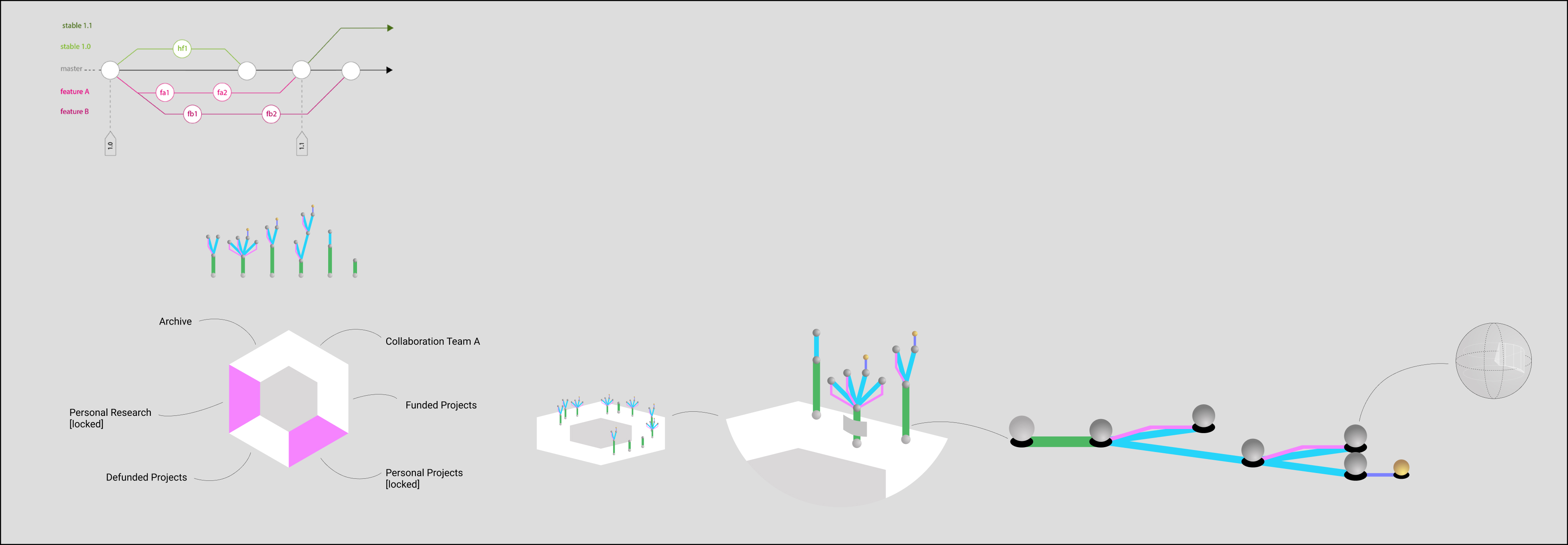
The first concept "Git commit forest" borrows its visuals from the software development world. Starting with a hypothesis (green path) into virtual meeting nodes (spheres) where collaboration breaks out into experiments (blue paths) that either fail and return to the previous node (pink path) or drive the growth of the project tree forward towards the next virtual meeting node.
This concept portrays a forest of projects where the researcher can see at a glance which phases (paths) take longest and what progressive state each of the project trees has.
In an octagonal ring around the researcher, the distribution of the trees in eight zones provides insight into the collaboration of the research team.
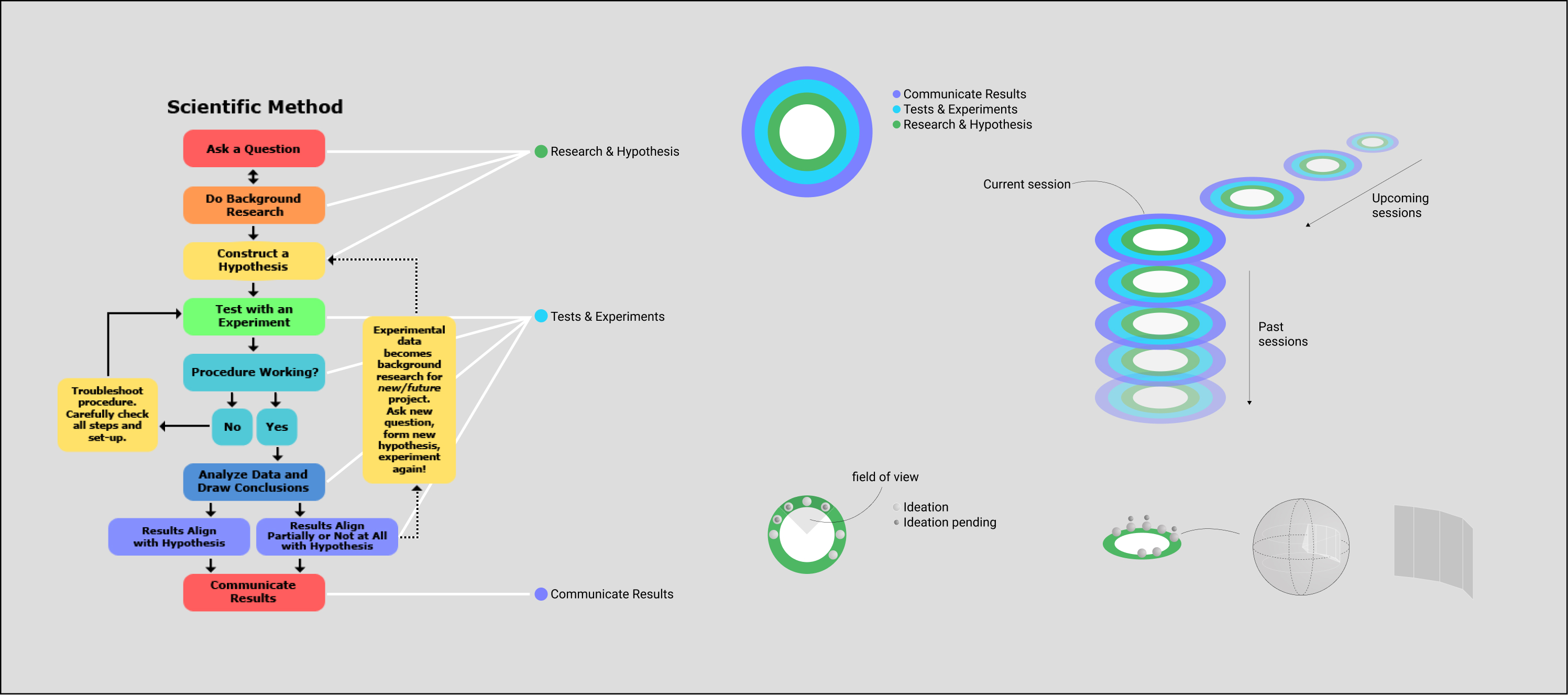
The second concept "scientific method" reimagines the concept of a time machine log. Following the process of the scientific method, I am structuring each scene in an onion-like layered space. In the center of the experience is the researcher that sees projects distributed on three different rings around them. The first (closest) ring is the green "Research & Hypothesis" zone where new and upcoming projects are located. The blue ring (middle) "Tests & Experiments" hosts all projects that have ongoing experimentation and validation. The purple ring (farthest) "Communicate Results" contains all the projects in their final phase. The objective is for the researcher to push the project spheres from zone to zone, literally "to get the ball rolling" on their multiple projects. The scene can share a look back of previous states of the projects and may, based on collected metrics of speed and project type, share projections on how long research will take, giving a glance into churn and capacity of the research team.
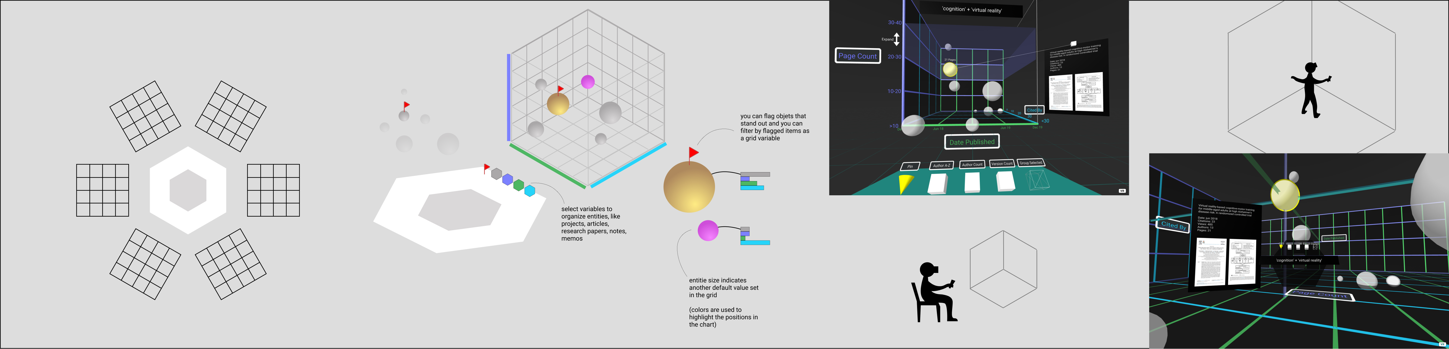
The third concept "Walkable Charts" takes traditional 3-dimensional charts to the next level.
The researcher is located in the center of the scene while she/he can populate a dimensional chart with multiple variables. The goal for this concept is the surface relationships of metadata on standardized research papers and pull these variables in an extremely flexible visual environment. Beyond the traditional three axes of the chart (height, width, depth) the research paper nodes (spheres) can show additional variables with size/shape and color range.
Interconnectivity, like the name of the university or the authors of the paper, can be visualized via connected lines, creating molecule-like shapes. Each side of the chart can be stretched and expanded asymmetrically to destress clusters of data. Most importantly, when the researcher is done creating their most insightful combination of queries and variables, she/he can then enter that chart like a landscape of data nodes and see the relationships of documents from different angles. Saving these landscapes will provide the researcher with explorational memory palaces and will provide deeper insight and access to meaningful research documentation.